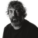
A good photograph isn’t automatically a useful PR photograph.
You can make something beautifully lit, perfectly composed and technically flawless, but if an editor can’t use it, a journalist can’t understand it quickly, or it doesn’t help tell the story, it’s probably not doing much for your PR.
That’s the bit that often gets missed.
PR photography isn’t just about making people look good. It’s about creating photographs that help a story travel.
If you’re launching something, announcing a new appointment, celebrating an award, opening a new venue, promoting an event or trying to get your organisation noticed, the photographs you supply can make a big difference to whether that story gets picked up and how prominently it gets used.
So what actually makes a photograph useful for public relations?
It should tell you something straight away
A strong PR photograph shouldn’t need a paragraph of explanation before it makes sense.
Ideally, someone should be able to look at it and understand at least part of the story.
Who is involved?
Where are they?
What’s happening?
Why might this matter?
That doesn’t mean every photograph has to be painfully literal. But context is useful.
If you’re announcing the opening of a new shop, showing the owner standing outside it is probably more useful than photographing them against a plain wall.
If you’re promoting a community event, show people taking part.
If you’ve won an award, show the person with the award, preferably somewhere relevant to what they actually do.
Give the photograph a job to do.
Faces matter
People connect with people.
That sounds obvious, but plenty of organisations still send out PR photographs dominated by buildings, banners, products or enormous groups of people where nobody is really identifiable.
If there’s a person at the heart of the story, show them properly.
Editors generally want photographs with clear faces, expressions and some sense of personality. That doesn’t always mean someone grinning directly at the camera. In fact, a slightly more natural photograph can often feel much stronger.
But we do need to be able to see the person.
A photograph of six people standing in a dark room 20 metres away might prove that the event happened. It probably isn’t going to make anyone stop scrolling.
Leave some room around the subject
One of the biggest differences between a photograph that looks good and one that’s useful is flexibility.
A very tightly cropped portrait might work brilliantly on Instagram.
It can be much harder for an editor to use.
PR photographs are often cropped into all sorts of shapes. They might need to work as a landscape image across the top of an article, a square thumbnail, a vertical magazine page or a narrow slot in an email newsletter.
That means it’s useful to have a bit of breathing room around the subject.
I’ll often shoot variations for exactly this reason. Some tighter. Some wider. Some horizontal. Some vertical.
You’re giving the person using the photograph options.
Keep the branding visible, but don’t let it take over
Logos can be useful in PR photography.
They can also make a photograph look like an advert.
There’s a balance.
If someone is being photographed at their workplace, having the company name visible in the background can add useful context. The same applies to signage at an event, branded clothing or a recognisable product.
But plastering a giant logo across the middle of the frame can make the photograph less attractive to editorial outlets.
PR photography usually works best when the branding feels like part of the scene rather than the entire point of it.
It needs to look professional
This doesn’t mean every PR photograph needs dramatic lighting and a huge production.
Quite the opposite.
Often, the most useful PR photographs are clean, natural and uncomplicated.
But they should still look intentional.
Exposure matters. Focus matters. Colour matters. Backgrounds matter.
Small distractions become very obvious when a photograph is published. A fire exit sign growing out of someone’s head. A half-empty coffee cup on a desk. A fluorescent light turning someone slightly green.
None of these things are disastrous, but they can make an otherwise strong photograph feel careless.
Professional photography is often about noticing the boring little things before they become annoying big things.
Give editors a choice
One photograph is better than none.
Five or ten genuinely different photographs are much better.
That doesn’t mean sending 150 near-identical images and expecting someone else to choose.
A useful PR set might include a strong portrait, a wider environmental photograph, an action shot, a detail, and a couple of alternative compositions.
The aim is to give somebody enough choice to match their layout without overwhelming them.
Think variety, not volume.
Don’t forget the caption
This isn’t technically part of the photograph, but it’s almost as important.
If you send out an image containing three people and nobody knows who they are, you’re making life unnecessarily difficult.
Include names, job titles where relevant, the location and a short explanation of what’s happening.
Spell the names correctly.
And make sure you know who is standing where.
“Left to right” can save an editor a surprising amount of detective work.
Think about the story before the shoot
This is probably the most important bit.
The best PR photography starts before anybody picks up a camera.
What’s the actual story?
Who is the story about?
Where is it likely to be published?
What photograph would help someone understand it?
Once you know that, the photography becomes much easier.
You’re not just turning up and taking some nice pictures.
You’re creating visual material designed to help somebody communicate something.
That’s a very different job.
Useful beats clever
I love making interesting photographs.
But PR isn’t always the place to make the cleverest photograph possible.
Sometimes the most useful image is simply a great photograph of the right person, in the right place, doing something relevant to the story.
Clear beats complicated.
Relevant beats flashy.
Useful beats clever.
And if you can make something useful and visually strong at the same time, even better.
If you’ve got an announcement, launch, event or story coming up and need photographs that people can actually use, get in touch.
I photograph businesses, organisations and community events across Surrey and the Surrey Hills, creating images that are designed to work in the real world, not just look good in a gallery.